How to make your designs blow up on twitter
First of all, let’s cut the pretentious baity title crap.
I have no idea what I’m doing, and why this post blew up. But it did. And I have some assumptions as to why.
Let’s draw a TL;DR, and then talk about each one:
- The style is very approachable
- The format was (almost) perfect for the medium
- The animation was buttery smooth
- (Most of) the details were there
These are only assumptions. I had absolutely no expectations for this post, and was veeeery surprised by the amount of attention it got. Was it just the algo that made it gain reach? Or was it because people actually really liked it? Honestly, I don’t know.
Tutorial dropping soon.
Assumption 1: The style is very approachable
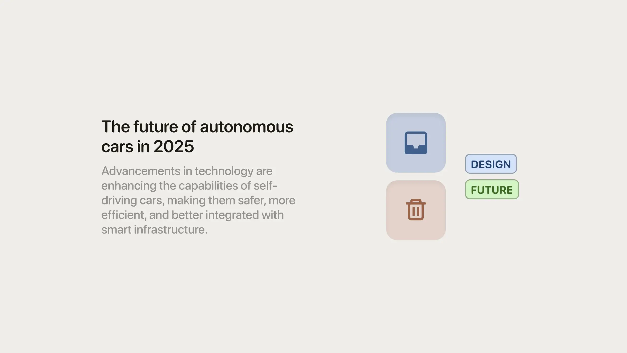
It starts with the subtle pastel colors, and spreads to the border radius, and the rounded typeface.
It just makes it look friendly. Easy for (lots of) people to vibe with.
There are no complexities in the UI—it’s a very focused animation to illustrate the interaction of dragging and dropping a document.
Assumption 2: The format was (almost) perfect for the medium
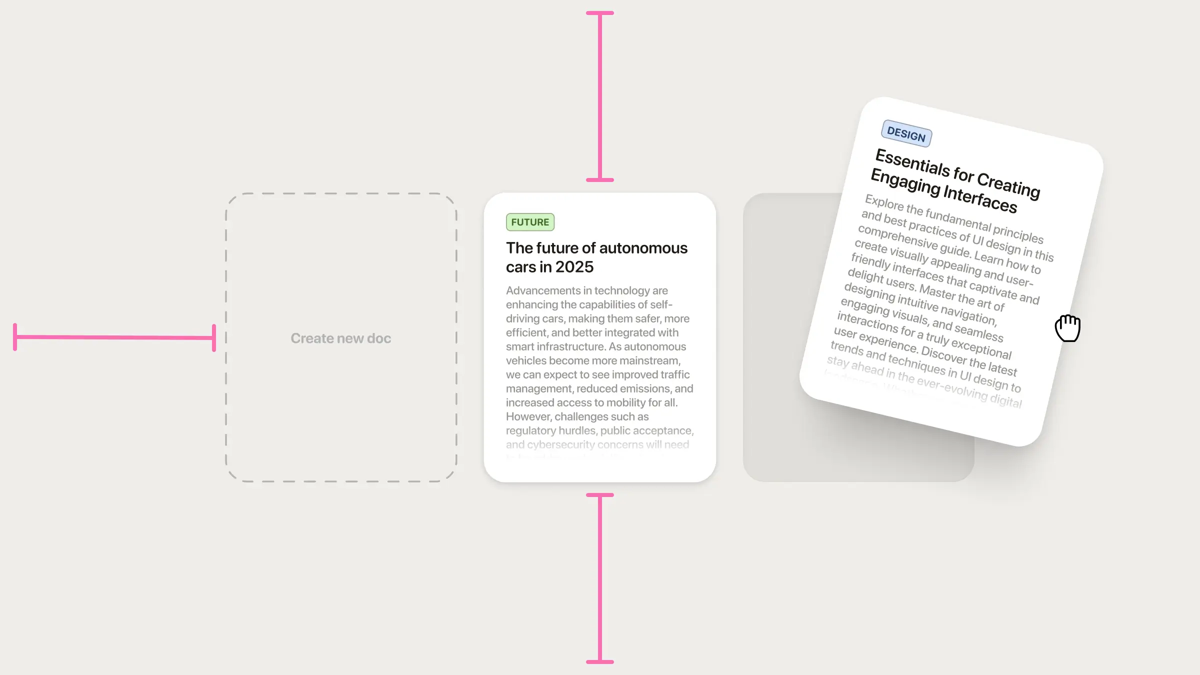
Even though I used a 1440px frame, the UI elements are scaled up. That makes it more visible when you’re browsing through your feed.
You can clearly see the animation, even if it’s small. You can even read the texts (I think). Honestly, now that I think of it, I could’ve made the cards way bigger to make it even better for the format.
If they were “regular sized”, you’d have to open the video in a big screen to be able to identify things.
Assumption 3: The animation was buttery smooth
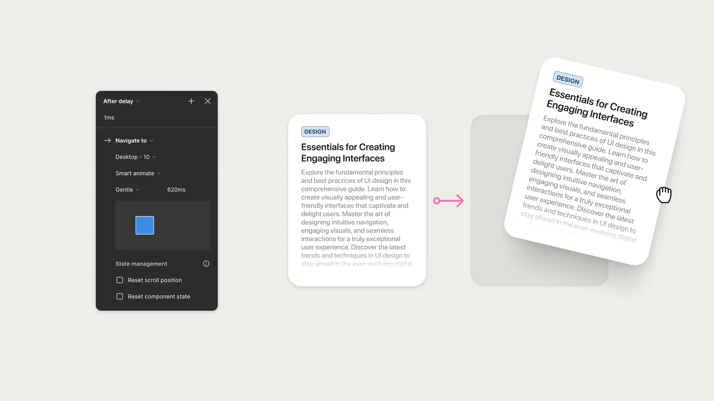
It all started with this.
I have seen so many examples of interactions made in Figma that were soooooo smooth. But all my previous attempts were laggy and dropped the frame rate so much. They looked awful.
So I really wanted to see if I could create something buttery smooth.
My guess is that in previous times, I just had too much on-screen, or has complex interactions between component variants, and that all made the frame rate of the prototype drop.
In this case, I had very minimal elements, and no complex interactions. Only changes between two frames.
Also, I used the “Gentle” easing from the “Smart Animate” on 620ms. It just feels so smooth to the eye, it slightly bounces at the end—it’s hardly perceptible—, but it’s enough for your mind to perceive it as friendly.
Assumption 4: (Most of) the details were there
There’s a lot of small decisions that—to me were very quick to make—, but for someone who’s just starting might not be obvious.
I think I spent the most time on the shadows, trying to make them look smooth, and not harsh. I don’t think I did a good job. But it was fine enough.
The spacing was adequate, both between cards, between elements inside of the cards, and also between text lines.
The colors of the typeface were also adjusted: I think I’m using the same hue as the background, but a darker tone. And in the category pill, I’m using the same hue as the pill background. I also tested the colors (manually) so they felt balanced with the beige from the background—more desaturated pastel tones.
Stay tuned on Twitter(X) for the tutorial.