Typography Secrets: OpenType settings
There is one thing most designers simply don’t take advantage of, either because it’s usually buried under menus, or because they simply never heard of it:
OpenType settings
They’re simply settings that you can toggle on/off to slightly change how characters of a font look, or behave.
It’s a cheat code to adding some personality to a font you already use, and make people wonder “Mm. What typeface is this? I’ve never seen it”.
And you’d be surprised how many fonts you already used, or came across, that have these feature:
- Inter
- Raleway
- Poppins
Just to name a few.
I believe Inter is the best example. Rasmus (the designer behind Inter) did an incredible job at adding seamless features to this typeface, so that it would feel both special, and appropriate for all occasions.
These are a few examples, from the Inter website:
Alternate Number Digits
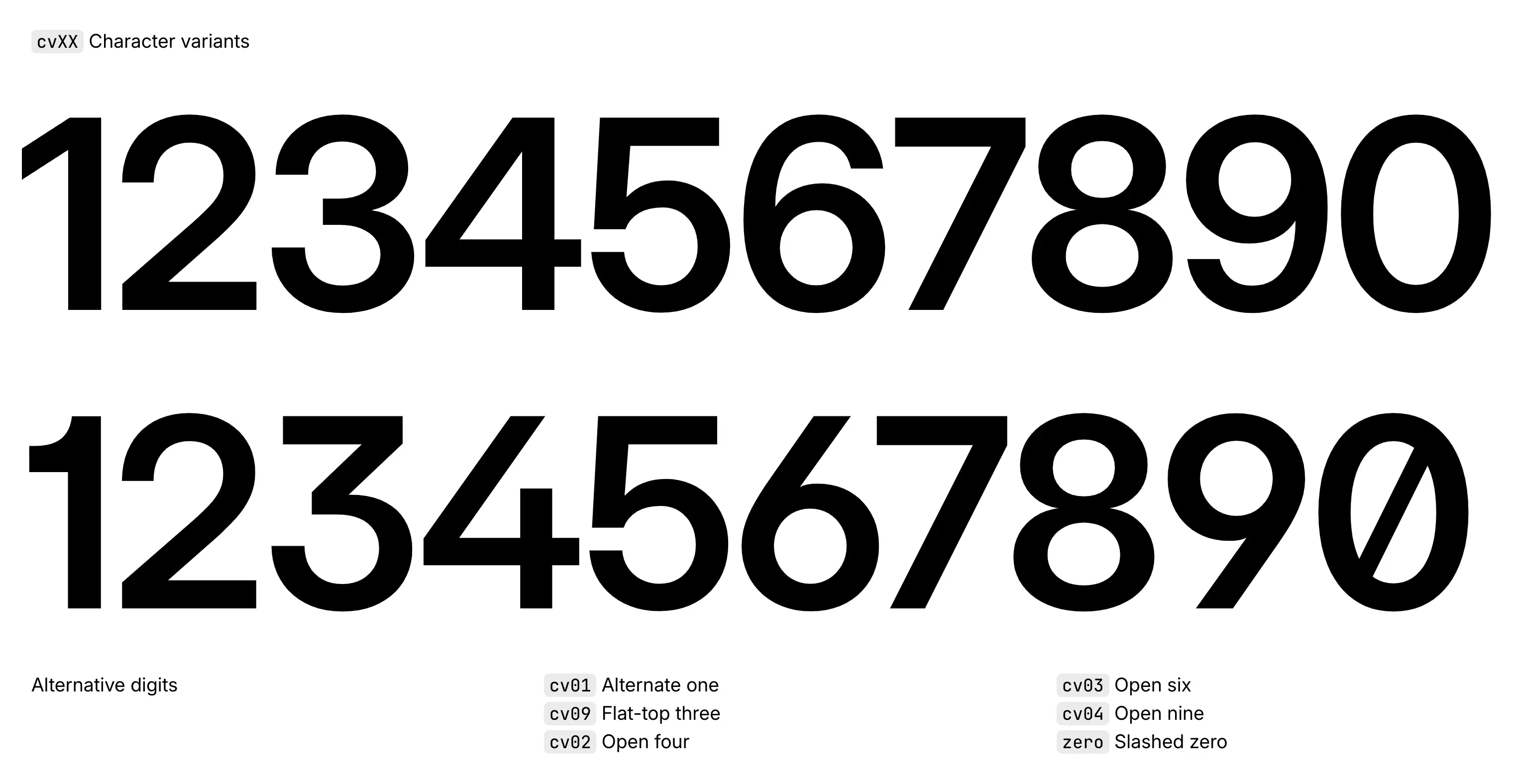
Personally, I really enjoy that number 1 from the second line, but prefer to keep the other numbers as the first line.
Alternate Characters
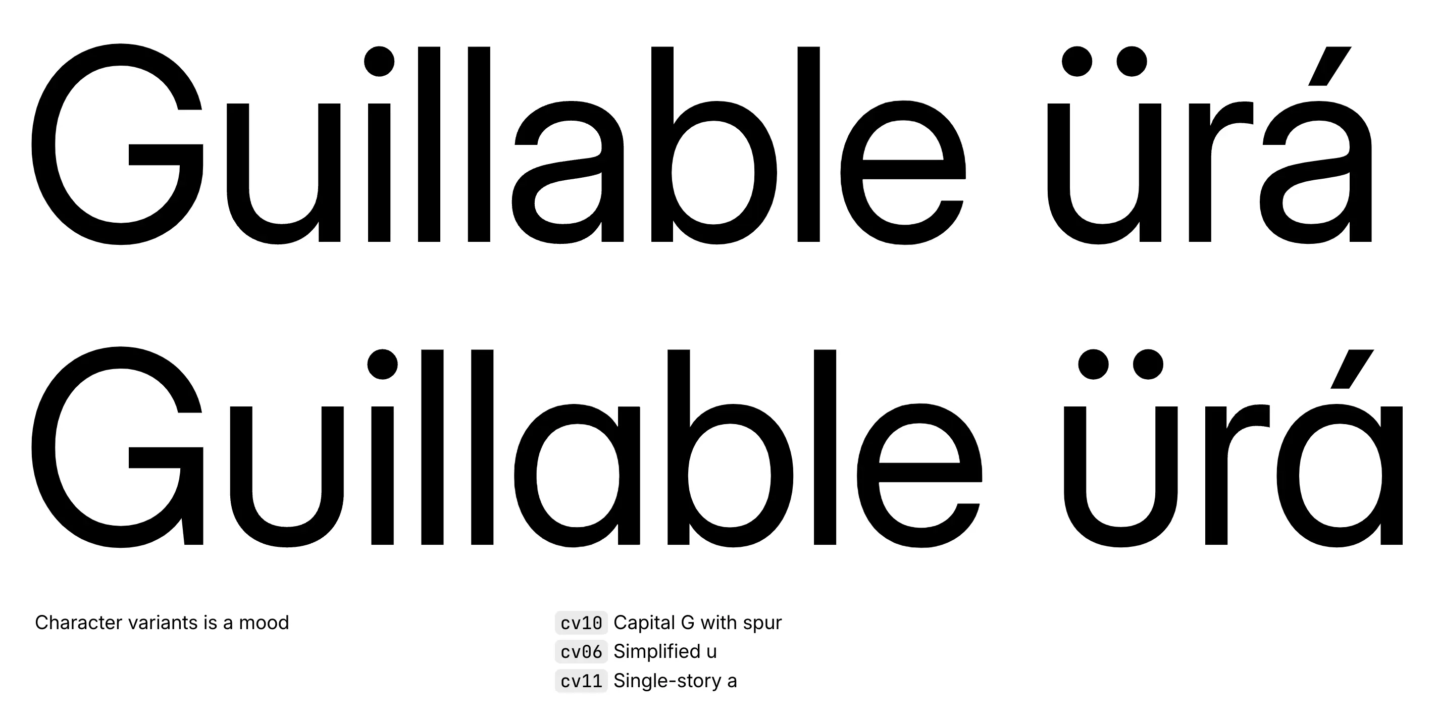
That uppercase G from the second line is also something I usually look for in Gs. But I steer away from that one-story lowercase “a” unless I really want the personality to come across as fun, playful, and approachable.
Alternate Punctuation
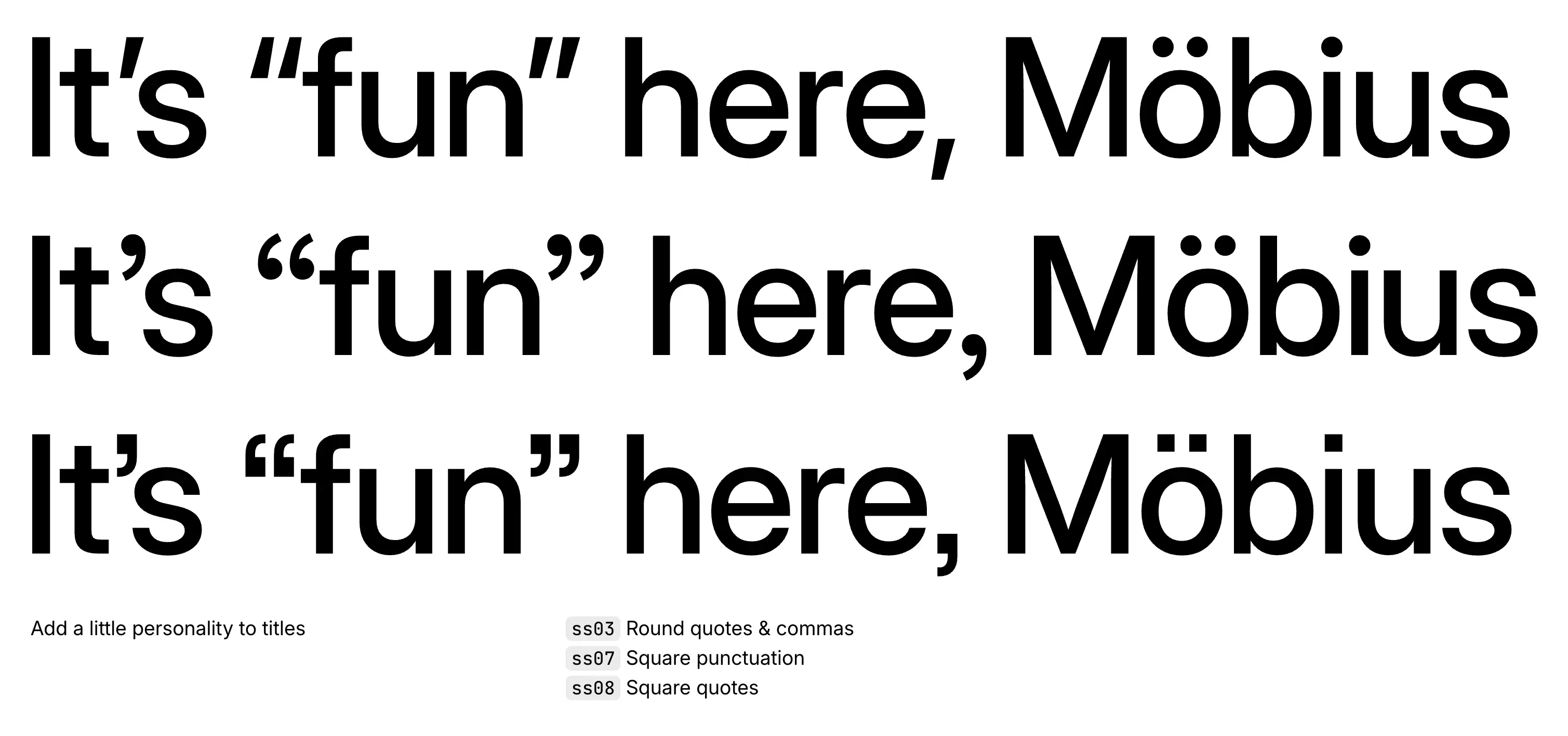
The round/square punctuations are just so classy. I honestly heavily dislike those simple punctuations that look like a line.
Tabular Numbers, Fractions, and Case Alternates
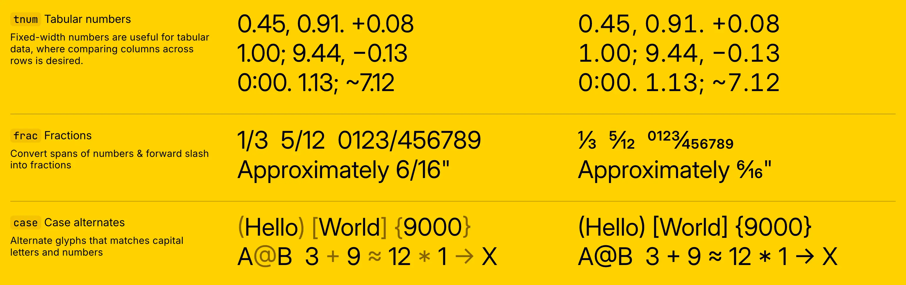
Now, these are some interesting features:
- Tabular Numbers: they’re a great way to introduce fixed-spaced numbers into your designs, and keep spacing consistent, especially in tables, and interfaces where you need to display a lot of data.
- Fractions: it just looks fancy when you have actual fractions within your text without adding a vector or image. It looks professional, and cool.
- Case Alternates: the typeface slightly moves the characters up to align with the font characters.
How to find these settings
Now, you might be wondering where you can find these settings. For some tools, they’re tricky to find. For others, they’re pretty straightforward.